Baume & Mercier Pop Up Boutique Hainan
Location: Hainan, China
Task:Design, Design- and Construction Document
Collaboration:Lui Design Ltd., Hong Kong
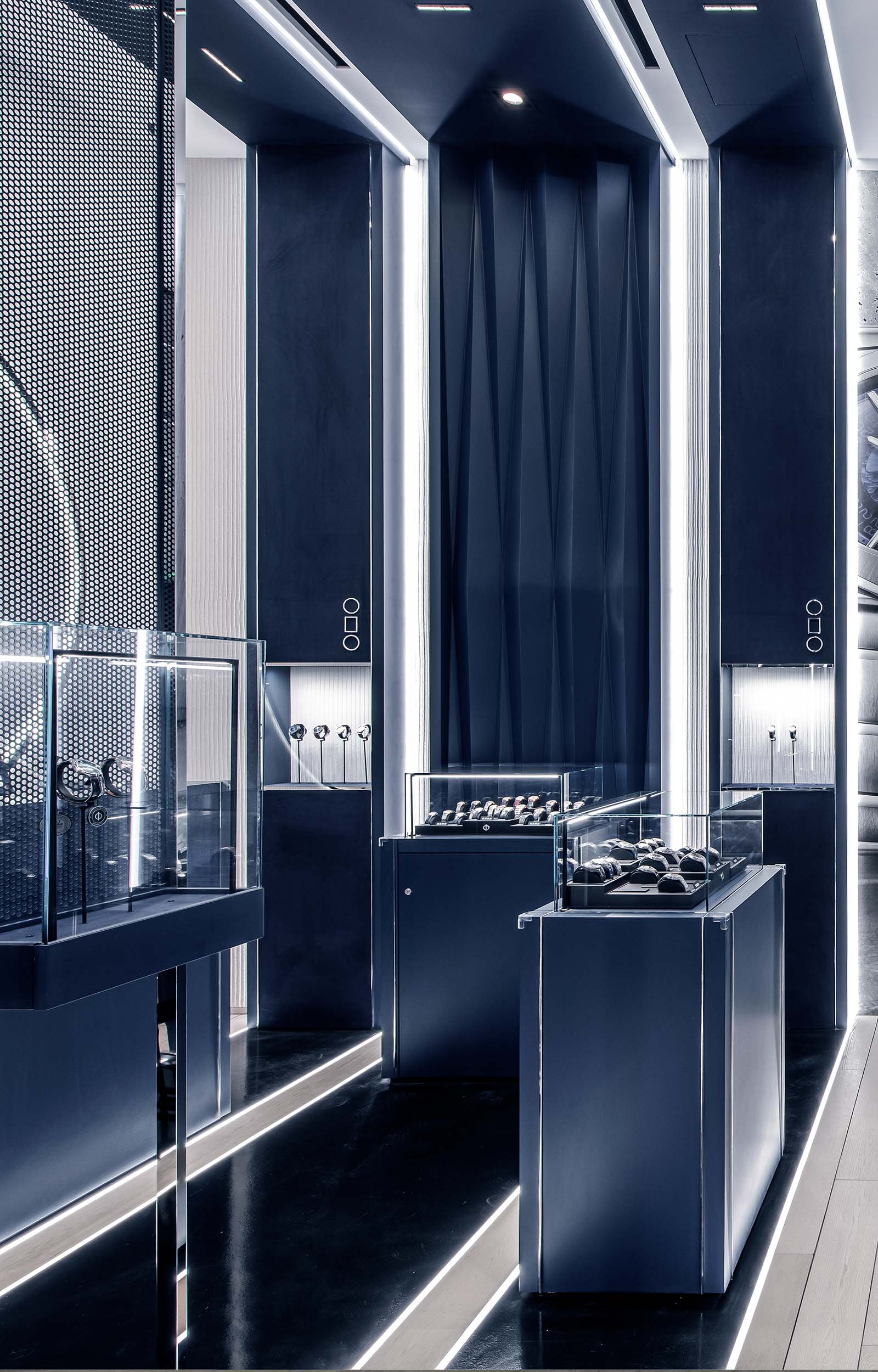
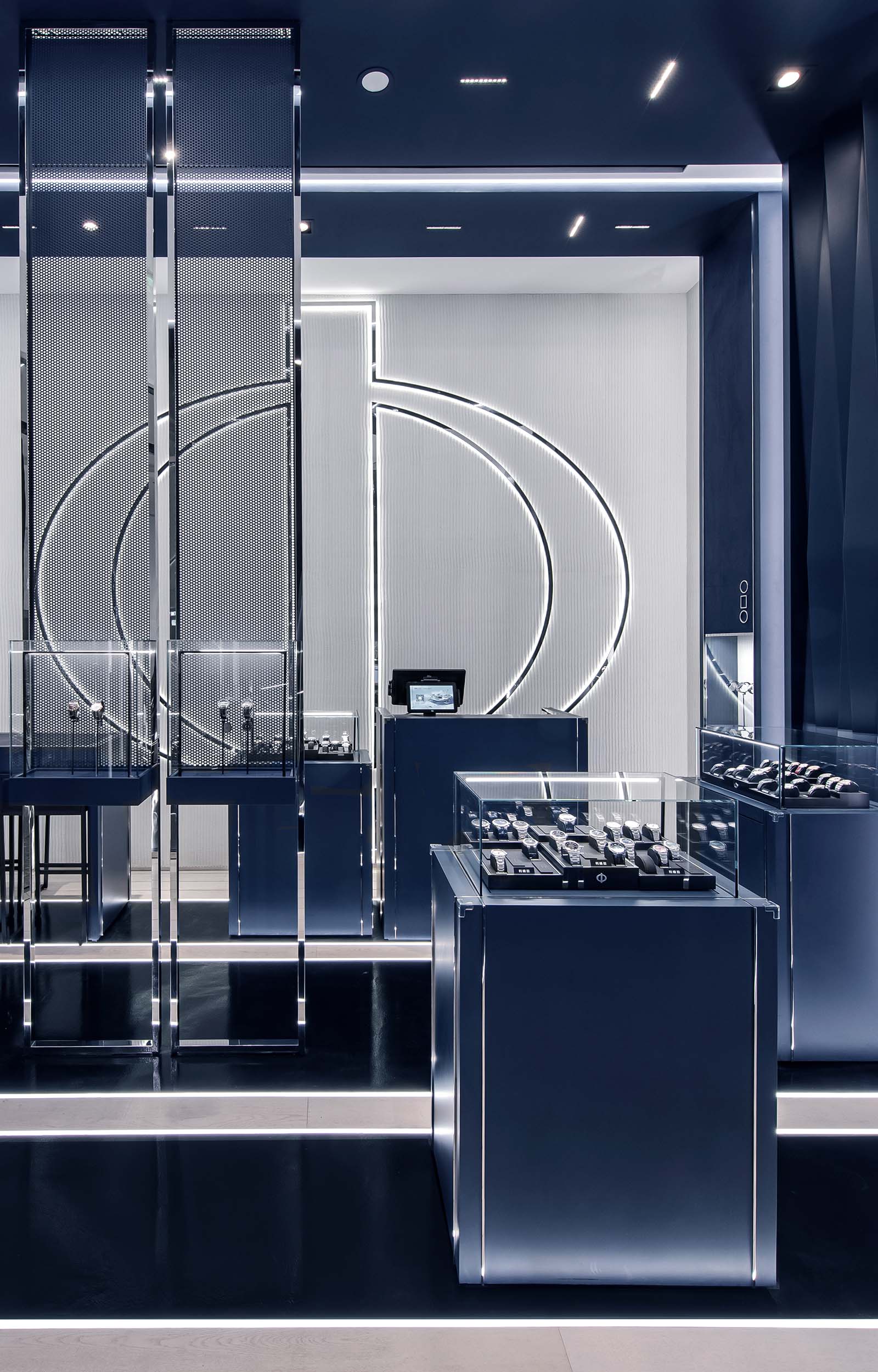
The Baume et Mercier pop-up in the newly opened Mall in Hainan is dedicated to the legendary and timeless Riviera collection. The idea of this pop-up was to create an “espace” with an atmosphere which goes beyond the boutique, where light and sculptural elements define and choreograph the space.
The pop-up was designed in continuity with the Baume et Mercier fair booths at the Watches and Wonders in Geneva, Shanghai and Sanya. The blue arches, underlined by linear lights, are reinterpretations of the dodecagonal bezel arches from the fair booths, and serve as spacial elements which rhythmize the space.
Due to the narrow floor plan of the retail space and the curved glass facade on three sides of the store, the challenge was to design the facade and the boutique with the same elements and materials in order to give the impression of a cohesive installation while creating a strong image from the outside. The facade elements allow the watches and the brand to be presented to the outside world in a transparent manner, making the facade an extension of the boutique.
The materials were chosen as a representation of the brands identity. Dark blue tones and parquet floorings which are reminiscent of a boat deck, are combined with polished chrome profiles and details, giving refinement and elegance to the whole. Comb plaster in its natural color brings an additional texture into the materialization. The use of light as a graphical element gives a very contemporary and artistic feel by enlightening the architectural structures. The space is completed by a large backlit Phi, the brand logo, which underlines the graphical side of the design. The displays and furniture elements are designed in continuation of the material and form language, offering a refined and diversified setting for the display of watches.


